Bedrock LinuxThis forum is for the discussion of Bedrock Linux.
Notices
Welcome to LinuxQuestions.org, a friendly and active Linux Community.
You are currently viewing LQ as a guest. By joining our community you will have the ability to post topics, receive our newsletter, use the advanced search, subscribe to threads and access many other special features. Registration is quick, simple and absolutely free. Join our community today!
Note that registered members see fewer ads, and ContentLink is completely disabled once you log in.
If you have any problems with the registration process or your account login, please contact us. If you need to reset your password, click here.
Having a problem logging in? Please visit this page to clear all LQ-related cookies.
Get a virtual cloud desktop with the Linux distro that you want in less than five minutes with Shells! With over 10 pre-installed distros to choose from, the worry-free installation life is here! Whether you are a digital nomad or just looking for flexibility, Shells can put your Linux machine on the device that you want to use.
Exclusive for LQ members, get up to 45% off per month. Click here for more info.
Would it be a good idea to have a bedrock screenshots thread?
If so, here's a screenshot to start things off...
In the picture, the xfce4 terminal from slackware's xfce is running in a debian awesome-wm. Shown in the terminal windows are pacman (the Arch package manager) running and a screenfetch recognizing the system as slackware. A debian Synaptic runs in the center of the screen.
Nice colors!
But unreadable ... I assume the image is scaled down?
As is typical in my experience, I sorta knew / should have expected someone would comment on that, and included more tell in my show.
No (unless you just didnt click again to see full 1:1 size). It is not scaled. The font, I made, nztt (& nzt/nzttt) (along with many others), designed for optimal pixel efficiency, without, imo, hampering readability (and I did test the difficult edge and push into extreme with fonts as far as the likes of bf which is more mere fathomnable than readable). nztt's my daily driver font used nearly everywhere.
Appeases both my need to see more information on screen at a time, and my dyslexia (especially in those colours). I like to think it's environmentally friendly, in less squandering of pixels (and the resources required to make and illuminate pixels.
Incidentally, many of those fonts I made, were made with a mind to, and testing against, how they make the bedrock ascii logo appear. 1 or 2 at least, top-prioritised that. hehe.
(PS: Some of those fonts in dbtfc, including nzt, scale, so would be useable on monitors with tiny pixel sizes. the likes of bf, do not scale.)
(PPS: Also, here's an example of my tmux session filled with monitors I keep on 2nd workspace, with nzt at double pixel size, for easier at-a-glance. also, notice, the htop has the bedrock strata column. ).
Thanks, that's much more readable.
I can see that it's not a true pixel font, some antialiasing happening. Maybe that's what confused me in the other screenshot.
Thanks!
I can already see that it's crispier than my trusty Droid Sans Mono.
The DejaVu family has developed a lot since I started using Linux...
Did you do anything additional to get it so crispy?
Did you do anything additional to get it so crispy?
Yes. Have to set up font hinting. The way to do this is different for every distro (init stratum in this case since it is Bedrock) and within that it seems to change every six months
Thanks again.
Font hinting can be defined by three stanzas in various fontconfig files, one that actually enables it, and another that defines the type. I have it set to 'hintfull' currently.
Would be interested to hear what yours is (in the screenshot), but of course I can also just play with the values.
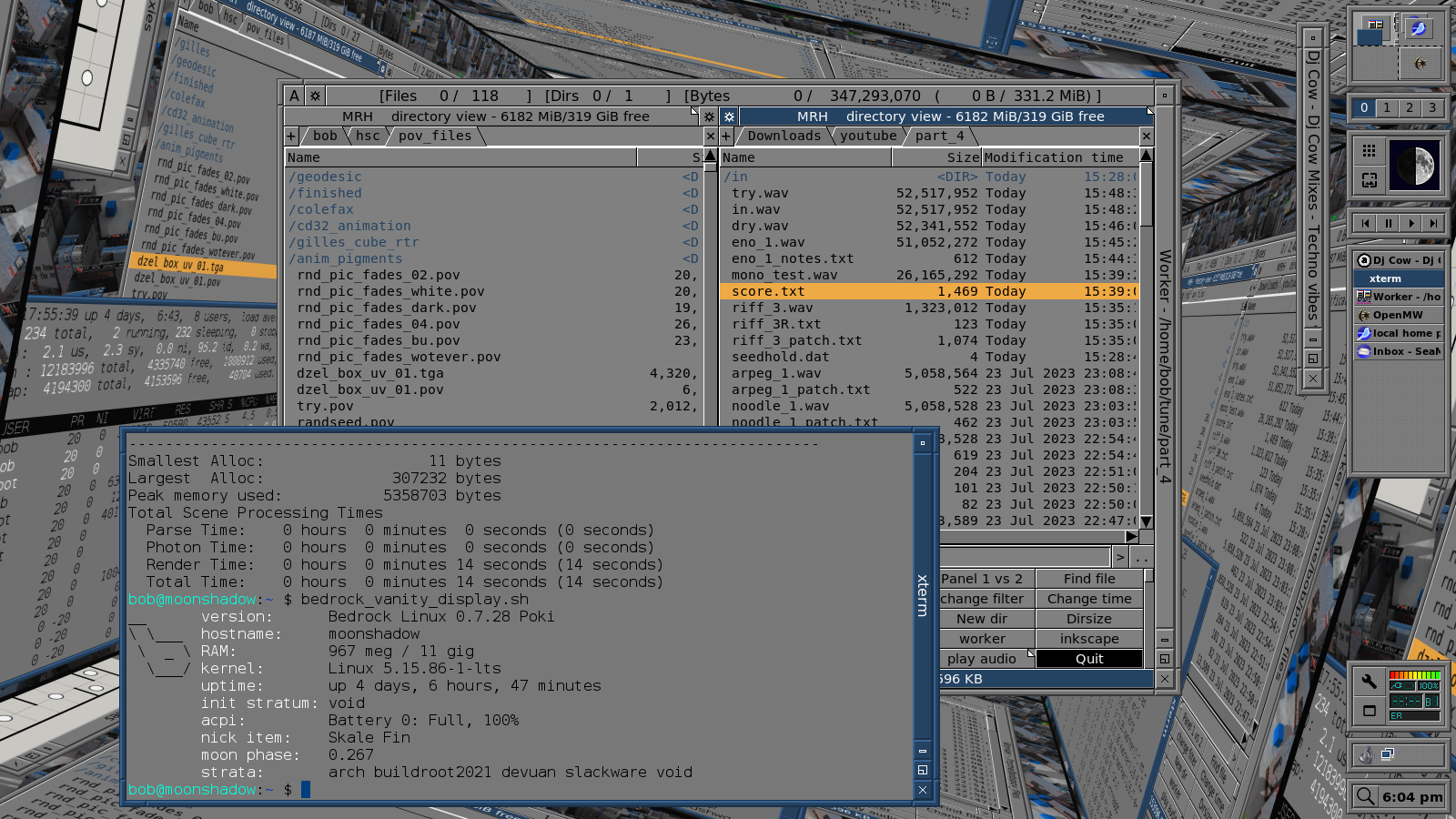
It's been long enough that I can post another one.
FVWM is the window manager ATM. The wallpaper is an earlier screen grab tiled on a 3d object in POV-Ray.
Hmm, I keep adding things to the display script that have nothing to do with bedrock.
LinuxQuestions.org is looking for people interested in writing
Editorials, Articles, Reviews, and more. If you'd like to contribute
content, let us know.


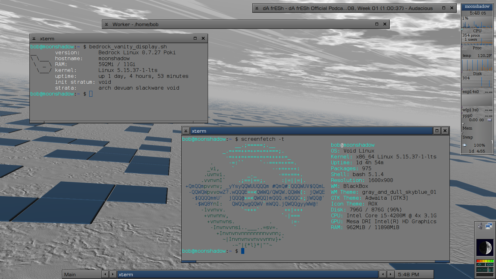


 my humble layout, sorry for the large screenshot